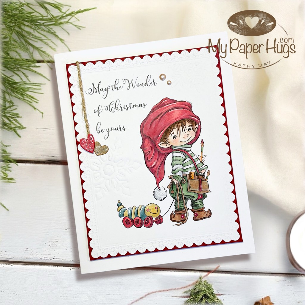
I do love primary colors, but prefer a muted version. Under-painting and glazing techniques with Copics gave the antique effect for this little cutie by Mo’s Digital Pencil. The key to this card was lots of white space and two main colors.
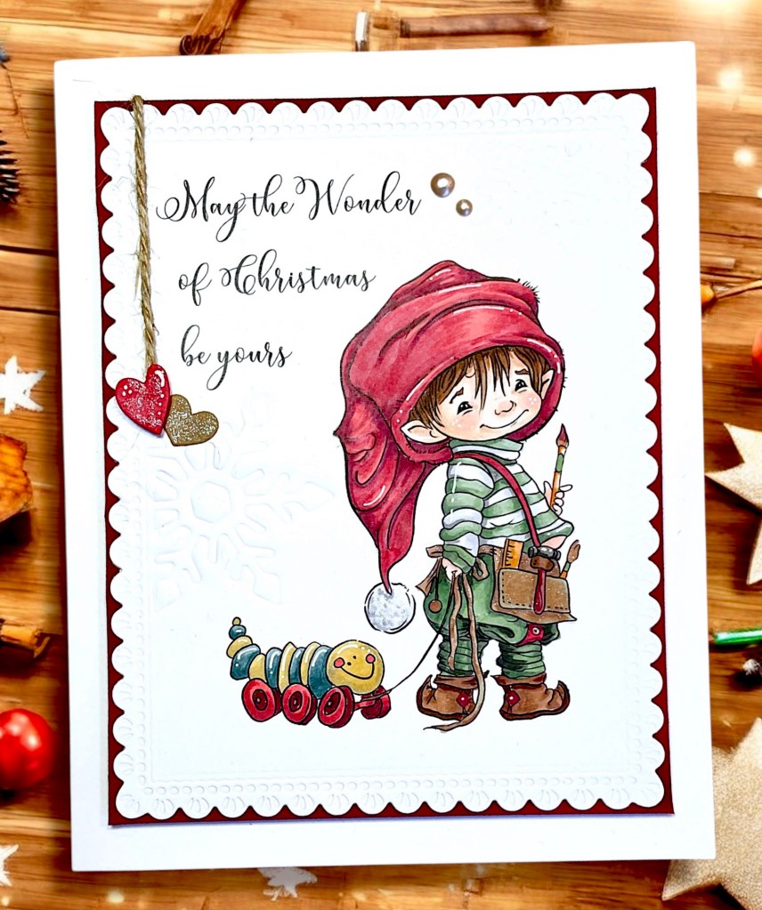
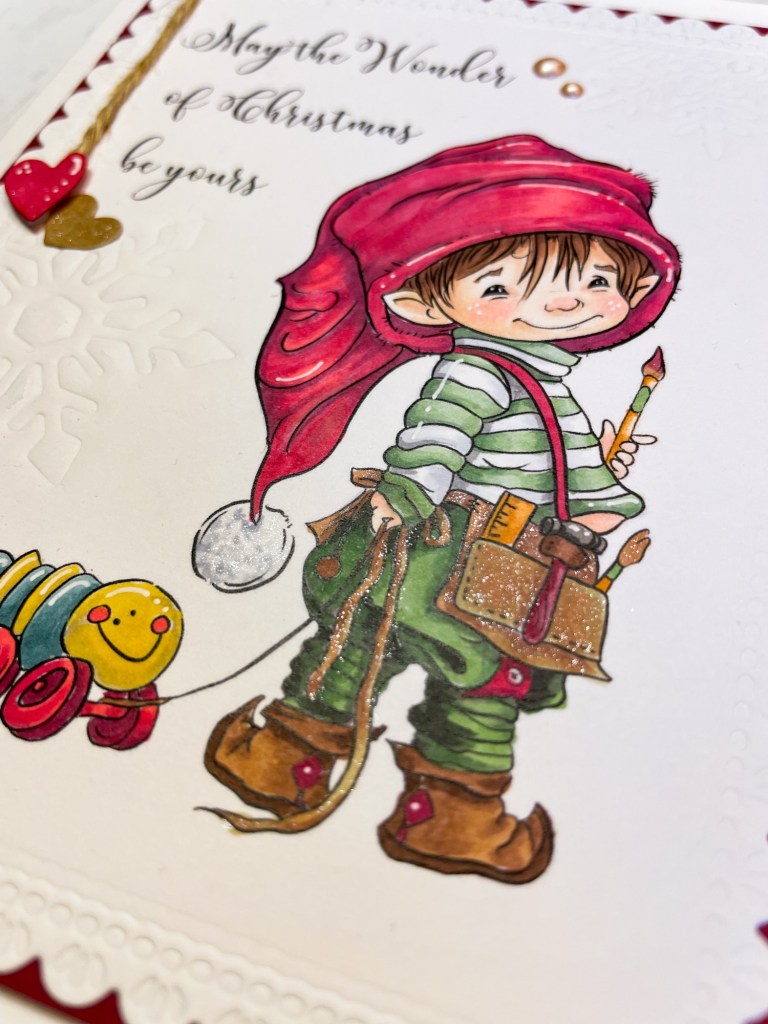
For coloring with copics, I started by creating a palette with Red and green, but “under-painting” all of the colors. I used C1-C6 for the Red underpainting and W2-W4 for the Green underpainting. The pop of Blue/Yellow on the toy was done the same.
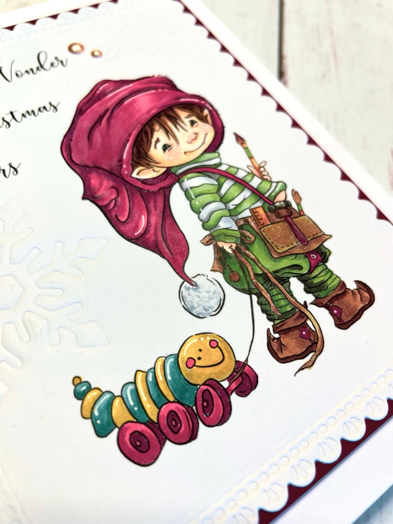
If you’ve never tried this, you will start with your Grays and color the image as you would using colors. Then you go back with the colors and do the same over the Grays. It not only knocks back the vibrancy, but will automatically provide some beautiful shading as well.

For the sentiment, the crisp black ink helped to make the image pop. I used the same coloring for the heart (red) for an understated embellishment.
Instead of a background or scene, I added interest by cutting the panel with a scalloped edge frame and using a snowflake die to emboss a single snowflake on the white panel.
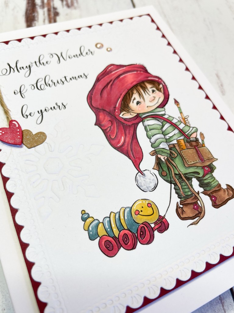
Mounting on a burgundy panel and keeping the margins wide brought it all together.
Give the technique a try and let me know how it goes!
Hugs all around – Kathy


I’d love to hear from you! ❤️